My poetic map to the shuttlecocks turned into a mystery novel where you, the viewer, are the detective trying to solve the case of who stole Claes Oldenburgs masterpieces. You will take a poetic journey, searching for typographic clues that will guide you to the thief and stolen art. Looking for these micro and macro details , creates an enjoyable experience which makes you notice the beauty of the environment all around you.
A correlating map gives you a more general area to look for the clues. With text hints accompanying you, you will experience a geographical map, literature hints, and image based clues to help you enjoy an interactive poetic experience.

Showing posts with label DSN 305 User Experience. Show all posts
Showing posts with label DSN 305 User Experience. Show all posts
Wednesday, May 5, 2010

Monday, May 3, 2010
The Poetic Revised
For my revises I have broken the tedious amount of the same spreads by inserting informational facts/clues to make the experience a little more educational and a little more harmonious to the rhythm of the book. The lines directing the image to the map is also reversed out to just a screen, which makes the read more clear. I am in between two cover choices right now, which both have their advantages and unique qualities that informs the inside. The first is my same Hardy Boy looking cover with the silhouetted shuttlecocks, being missing from the surface. The second idea is a die-cut shuttlecock with typographic letter forms floating behind the dust jacket.


Friday, April 23, 2010
Poetic Map: The Search for Oldenburgs Art
My concept for the poetic map is based on the a hardy boys/cloak & dagger mystery feel. The map shows you the shuttlecocks as you take an adventure to solve the case of the thief behind who has stolen the shuttlecocks. This booklet format gives you an overview of the scenario, hints and clues, typographic ransom-note imagery, and a coordinating map to show you a macro and micro view of where to search for these clues in between the design building and the last shuttlecock. The poetic aspect is that you are engaged and participate in a storyline and mystery instead of a standard practical map from point A to point B. The other aspect of the term poetics is the micro context of the clues will make your trip more enjoyable, by taking your time to notice the details and beauty of the architecture, nature, and energy of the walk towards the shuttlecocks.
These images are revises from my 1st round of user testing, the issues I have were to show more of the context within the photos, clarity of the map, and more in-depth text based clues.
The format everyone seemed to like, it was a nice size, the interactive part of filling in letters/keeping track of your clues was another plus to further elaborate on a poetic experience and the aesthetics were spot on.


Tuesday, April 13, 2010
Shuttlecock Map Concept
My poetic map from the design building to the Nelson Atkins Museum of Arts' Shuttlecocks will be an ABC's typographic way-finding experience. Route markers of different typographic letters and signage will guide you through your journey. Photos within a booklet will also let you compare to see if you are on the right path. I will find typographic letters and photograph them starting at the design building=A (within the kc'A'i banner outside) and going to end at some significant letter at the last shuttlecock on the journey. I might include a view finder so that you can spot and compare to the images within the booklet.
The look and feel is still to be decided, however I am set on this educational, poetic, and interactive concept.

The look and feel is still to be decided, however I am set on this educational, poetic, and interactive concept.

Saturday, April 10, 2010
Acme Persuasive Part II: Revises
From the feedback I have received in my presentation, I've changed minor things to make the Acme Surface Cleaner campaign more consistent and effective.
Here are the changes upon feedback:
1. Make the wipe on the building more recognizable on magazine ad
2. Revise layout and hierarchy of logo on magazine ad
3. Change all the copy to one used on website page "Naturally Strong, Unnaturally Clean"
4. Get rid of the personal mailing address label on the magazine cover
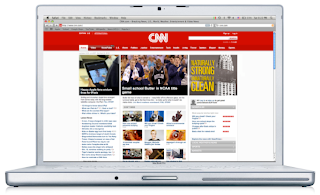
5. Remove the acme logo and title on CNN web banner, its a link to the site reargless
6. Remove the large quotation marks on the website
---------
Things I've kept and highlighted:
A. The blocky container-like text, although used before, feel that its logical and appropriate for such an industrial and masculine product.
B. The theme of using industrial objects, like a building, to enforce the hyperbole of ACME's strength.
C. Layout the website as it looks on the actual product label, solid band across that breaks the plains.
D. Kept the product photo out of the ads, thought it was a little redundant and underestimated the intelligence of the reader or consumer.




Here are the changes upon feedback:
1. Make the wipe on the building more recognizable on magazine ad
2. Revise layout and hierarchy of logo on magazine ad
3. Change all the copy to one used on website page "Naturally Strong, Unnaturally Clean"
4. Get rid of the personal mailing address label on the magazine cover
5. Remove the acme logo and title on CNN web banner, its a link to the site reargless
6. Remove the large quotation marks on the website
---------
Things I've kept and highlighted:
A. The blocky container-like text, although used before, feel that its logical and appropriate for such an industrial and masculine product.
B. The theme of using industrial objects, like a building, to enforce the hyperbole of ACME's strength.
C. Layout the website as it looks on the actual product label, solid band across that breaks the plains.
D. Kept the product photo out of the ads, thought it was a little redundant and underestimated the intelligence of the reader or consumer.


Monday, April 5, 2010
Acme Persuasive Part II
The persuasive part II for me was a nice compliment and contrast from gimmicky hooks within the 2D to the aesthetically logic persuasive of the 3D product. My Acme advertisements are focused around the "strength" of the cleaning product. My target audience loved over-powering, masculine, and high contrast ads and products. My advertisement is based off of a hyperbole that the industrial cleaning product is so strong that it can wipe an entire building completely away. The building represents an industrial and strong object or surface that can relate to the essence of my targets environment. I wrote two bits of persuasive copy that support the theme of strength, one is based off of logic and the products strength in the natural elements and ingredients, and the other is a humorous play off of not knowing your own strength.
Naturally Strong, Unnaturally clean.
and
We don't know our own strength.
The CNN banner ad follows the same idea, the object here is a lumber truck; once again the strong and industrial element.
My website is black and white with the wood textures in the background to re-enforce the organic or all natural element. It gradates to pure black in the middle where the logo sits in its container. The five web links: our mission, our planet, our packages, our surfaces, and our company sit within a thin horizontal bar in the center of the website; this mirrors the exact layout of the products actual labeling to further the consistency and continuity.
I've used Popular Mechanics for my magazine because this publication is currently sitting on the coffee table in all of my target users' houses. I've also used a laptop to mock-up my product, because my user is an apple mac book fan, not a pc desktop user.
Acme all natural surface cleaner truly is naturally strong and unnaturally clean. This product was made for the brawny man and his responsible environment.


Monday, March 29, 2010
Reveal the Persuasive Part 1
Acme's All Natural Surface Cleaner is a three product line brand that carries some of the most effective and environmentally friendly cleaning agents and ingredients within the market of Cleaning Products.
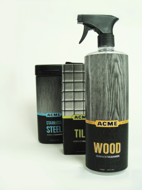
My product line relies on the strong black and white imagery of the actual surface each specific cleaner is meant for and also color coats the different products to punch the contrast and shopper-awareness from the monochromatic background. This product being meant for a masculine male audience, the over all aesthetics of the product reflect an industrial feeling of boldness and quality. The typefaces used are Serifa, Univers, and Myriad Pro, this combination creates a dynamic presence of power and dominance over the dirt and grime that exists within your own household.
The ritual-of-consumption element is a meter on the side of the products that show how much cleaning agent remains and also how much square footage the remaining content can cover. My product line consists of stainless steel wipes, wood surface sprays, and tile powder agents. The label contains typographic elements that lead your eye around the packages and not hold your eye on a specific location. These three products packaging all have the, near, same height, have sharp edges and broad shoulders (no smooth tapered curves) to reinforce the sense of masculine and powerful appearance.
Over all the practicality, strong use of color/image contrast, and typographic layout and form... persuade the consumer to pick up Acme Surface Cleaner off the shelf and prepare them to "tame the wild indoors."


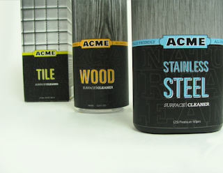
My product line relies on the strong black and white imagery of the actual surface each specific cleaner is meant for and also color coats the different products to punch the contrast and shopper-awareness from the monochromatic background. This product being meant for a masculine male audience, the over all aesthetics of the product reflect an industrial feeling of boldness and quality. The typefaces used are Serifa, Univers, and Myriad Pro, this combination creates a dynamic presence of power and dominance over the dirt and grime that exists within your own household.
The ritual-of-consumption element is a meter on the side of the products that show how much cleaning agent remains and also how much square footage the remaining content can cover. My product line consists of stainless steel wipes, wood surface sprays, and tile powder agents. The label contains typographic elements that lead your eye around the packages and not hold your eye on a specific location. These three products packaging all have the, near, same height, have sharp edges and broad shoulders (no smooth tapered curves) to reinforce the sense of masculine and powerful appearance.
Over all the practicality, strong use of color/image contrast, and typographic layout and form... persuade the consumer to pick up Acme Surface Cleaner off the shelf and prepare them to "tame the wild indoors."


Sunday, March 21, 2010
ACME LABELS - NEAR FINAL
After a few surveys from friends, family, and classmates - they all chose this specific direction for my labels. Its very bold, masculine, and industrial looking; exactly what I was going for. The vertical nature of the type gives directional contrast and opens up some of the container-like layouts that I've comfortable with. The line of products is split into 3 categories of Stainless Steel wipes, Wood surface spray, and porcelain tile powder. They are also color coated and have a window of texture within the ACME logo.
I think they turned out well and is a clear relationship to my target audience.


I think they turned out well and is a clear relationship to my target audience.


Monday, March 15, 2010
Label Comps
This is just the Wood-Flooring label for my series. I pictured the wood floor label being on the spray bottle so it is more elongated and vertical more than horizontal. I am working on the back side of the label that contains a content level to participate in the slow consumption of the cleaning product, the barcode, and ingredients.


Sunday, March 14, 2010
User Survey
I know for this project that we are allowed to create our own name for the product. So for my Surface Cleaner called "TURF" I surveyed 7 people on their immediate reaction to the word by itself (first word to pop in your head) and then how they thought of it as a name for a Surface cleaner. Here is what they said.
TURF the word:
1. grass
2. ground
3. territory
4. field/grass
5. property
6. possessive
7. territory
Turf for a Surface cleaning product:
1. turf relates to surfaces nicely, not confusing
2. its a good, condensed title for cleaners
3. its sounds nice and feels like the the person using it takes pride in their house and its hygiene
4. at first I thought of football fields, but it does work nice for a male geared surface cleaner
5. very possessive and takes ownership of your floors and counters
6. a bit arrogant, but in a humorous way to show pride in your house
7. its not confusing and has a nice relationship to the actual product being a surface cleaner, it shows -dominance and seems to lean towards the males; almost like auto supplies
My survey takers were my family members, friends, and 2 complete strangers.
I think the name turf works nicely, but I will still play with ACME to see a nice contrast. The only reason I am going with the option of using my own name is flooding the market with a recognizable student project. I have heard time and time again of seeing the same names and title pop up that defines them as institutional projects that doesn't take a whole lot of freedom or ownership with the project.
That is my only issue with using TURF over ACME, recognizable institutional projects aren't taken as seriously over projects which they cant tell if it is or not.
Wednesday, March 10, 2010
Acme research/inspiration
I've defined my target and started on a pretty decent label that I believe sums up my audiences taste and familiarity. My Acme Turf label aesthetically draws inspiration from various sporting good equipment brands, automotive product lines, mens' hygiene supplements etc. I've included a few links to a specific look and feel that I'm going for, as well as a few comparable competitors links below.
Specific Inspiration
Shock Doctor
Every Man Jack
Comparables
Method
Greenworks
Meyers
Specific Inspiration
Shock Doctor
Every Man Jack
Comparables
Method
Greenworks
Meyers
Monday, March 8, 2010
Branding Comps01
After my research panels and semantic sheet, I've arrived at a short word list that sums up my audience and the essence of my Surface Cleaning product.
Masculine
Powerful
Efficient
Brawn
Durable
... the list goes on.
Being a household surface cleaner marketed towards the active, brawny man, I chose a few words that could work as a subtitle to ACME that could support the idea of a dominant, strong, possessive area of his household domain... TURF.
Turf to me signifies a protective and possessive piece of property that would be geared towards my target audience. I have the back up title of TAME, "Tame the Wild Indoors." I am going to ask a few novices their immediate responses to the term "TURF" and see if the title is still appropriate for the product and informs it respectively.
If all fails, I will go back to ACME SURFACE CLEANER, but I'm not giving up yet!!!
As far as my visual solution, so far, I have created the logo type and icon from hand; is my own original type. The subtitles are a mixture of Serifa, SF Republic, and Accidens. I figured they all had qualities of industrial strength and sleek masculine products. The image mask reveals whatever the specific surface material is. The stacked type and containment works well for an initial label, but I have done that several times before and will try to break that static containment to utilize more of the real estateof the package.
The color palette is black and another bright color to separate the differences within the product line.
In terms of a package that participates within the consumption of the product, I was thinking in terms of a sturdy and permanent hang tag label that acts as a handle/holster for the bottled products. This would give the label a practical function and also will be involved with the contents of the products until it runs out and needs to be recycled.
Humor, novice survey and user interaction is where I'm heading next.


Subscribe to:
Posts (Atom)