
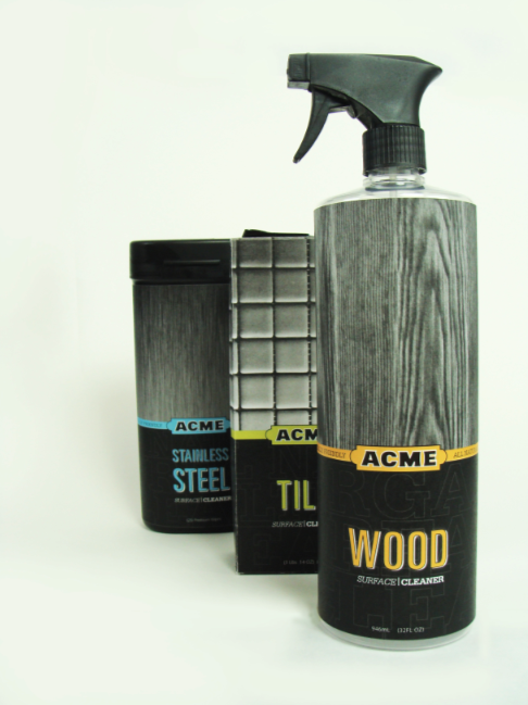
My product line relies on the strong black and white imagery of the actual surface each specific cleaner is meant for and also color coats the different products to punch the contrast and shopper-awareness from the monochromatic background. This product being meant for a masculine male audience, the over all aesthetics of the product reflect an industrial feeling of boldness and quality. The typefaces used are Serifa, Univers, and Myriad Pro, this combination creates a dynamic presence of power and dominance over the dirt and grime that exists within your own household.
The ritual-of-consumption element is a meter on the side of the products that show how much cleaning agent remains and also how much square footage the remaining content can cover. My product line consists of stainless steel wipes, wood surface sprays, and tile powder agents. The label contains typographic elements that lead your eye around the packages and not hold your eye on a specific location. These three products packaging all have the, near, same height, have sharp edges and broad shoulders (no smooth tapered curves) to reinforce the sense of masculine and powerful appearance.
Over all the practicality, strong use of color/image contrast, and typographic layout and form... persuade the consumer to pick up Acme Surface Cleaner off the shelf and prepare them to "tame the wild indoors."


No comments:
Post a Comment