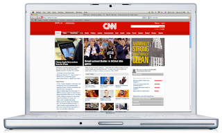
From the feedback I have received in my presentation, I've changed minor things to make the Acme Surface Cleaner campaign more consistent and effective.
Here are the changes upon feedback:
1. Make the wipe on the building more recognizable on magazine ad
2. Revise layout and hierarchy of logo on magazine ad
3. Change all the copy to one used on website page "Naturally Strong, Unnaturally Clean"
4. Get rid of the personal mailing address label on the magazine cover
5. Remove the acme logo and title on CNN web banner, its a link to the site reargless
6. Remove the large quotation marks on the website
---------
Things I've kept and highlighted:
A. The blocky container-like text, although used before, feel that its logical and appropriate for such an industrial and masculine product.
B. The theme of using industrial objects, like a building, to enforce the hyperbole of ACME's strength.
C. Layout the website as it looks on the actual product label, solid band across that breaks the plains.
D. Kept the product photo out of the ads, thought it was a little redundant and underestimated the intelligence of the reader or consumer.


No comments:
Post a Comment