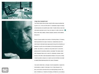
Concept #1 is based off of having a conversation, where horizontal drawers open up to Massimo and Kathy's views on modernism and postmodernism. There are several options along the essays to click either highlighted text or sidebar buttons to activate visual examples or supporting pull quotes.
The layout and palette is very simple but visually easy to navigate. It is based on a few collections of swiss page layouts, but with hidden drawers. The palette is pulled from Massimo's American Airlines logo; red for Kathy and blue for Massimo.
Concept #2 is focused on a central navigation bar that gives you the immediate options to compare each others views from top to bottom.
The palette and hand written signatures were inspired from Target co. special designer collections and Michael Graves identity works.
Concept #3 is the reflected product of the Mondrian squares. Photos fill each square and go to a more specified subtopic of modernism and postmodernism. The names "Vignelli/McCoy" at the top are the main navigation to reach their essays which have similar pullout button options for added examples.
...........
#1
#2
#3
In Chrome Context


No comments:
Post a Comment