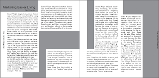
Here are a several layout iterations ranging from all over the place: type choice, scale, column size, column placement, asymmetrical composition, and integration of type and image. I'm just throwing everything I have out there right now to see what sticks. I wanted to emphasize the contemporary shapes of Russel Wright's work so for most of the spreads, the text and image containment is symmetrically shaped, along with the type choices, san serif minimalism of the lack of ornate accents.


No comments:
Post a Comment