
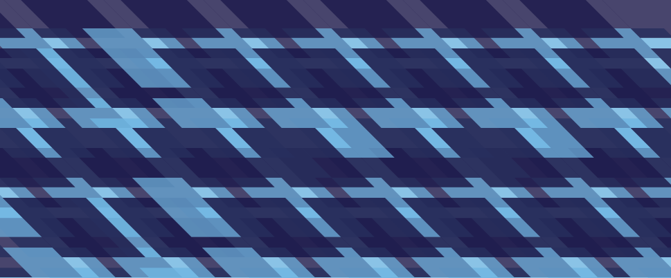
The palette will be a template of interchangeable colors that cover the primary and secondaries of the color wheel. The template will be set by us and resemble a duo-tone look and feel that will cross over to the complimentary scheme to further the effect of multiple/contrasting messages. For now the blue is our primary choice for duplicity. There are multiple layers, values, and hues of blue forms within the mask.
We have chosen several type faces to use throughout our campaign that reflect our visual identity and also have good contrast in weight and aspect ratio. We are using Vipond Angular for our primary titles and headers, this typeface is also the font that carries the name "duplicity" in our logotype. The geometric angels and forms reflect the modular potential of reading multiple messages from multiple perspectives.
Letter Gothic is a slender contrasting typeface with accentuating curves to contrast Viponds rigid angles. Letter Gothic is the secondary/supporting typeface for subtitles within the identity. The body copy that follows Letter Gothic is between Helvetica Light and Universe. The weight, aperature, and axis shift is something that Lance and I though is a good overall compromising factor between our primary and secondary typefaces.
These patterns and graphic supporting elements are taken directly from sections of Viponds letter forms. Screening them in different hues and values creates a nice layering effect that forces flat and depth together in a plane of clarity between the two.
Our Logo/Icon in general will have interchangeable possibilities for guest speaker photos, event images, etc. The layering of colors and masking will be distributed evenly and elegantly throughout the artifact campaign.
Duplicity embodies the ideals of multiplicity and contrasting messages being read from different perspectives and contexts.
----------------
Logo Graphic and Typeface


Patterns and Graphic Elements


I find those patterns to be really sexy. Good stuff! I like that you brought the logo of the "d" out of the word duplicity. It looks much more sophisticated with all of the letters on the same x-height.
ReplyDeleteluv you,
Mo
i agree with mo about the patterns -- they're quite awesome. nice work there.
ReplyDeleteyour rationale is solid and the resulting visual forms are generally very nice. of course i have a few thoughts...
the logotype is pretty interesting, but kind of awkward feeling. it looks like maybe a free font. the C is wonky at the apex and baseline where those angles are, and the U, L, and maybe I lack character that the other letters have. i'd either modify it slightly or try to find something better but of similar qualities. on lance's blog i mentioned fontstruct.com and all of those fonts are free -- it's a user-generated font community all working off grid-based font software on the site. check it out.
also consider moving those complementary colors you mentioned into the D itself to see what happens. just a thought. OR consider how all those colors you mentioned will play out across the artifacts. will each artifact get its own color?
i'm not really buying the layering inside the D as relating to lance's experiments. i can see, however, that in the large D you show, there is a P living inside it. in that way it is two letterforms in one. i kind of like that idea, but it doesn't immediately strike me as being about what lance was exploring. not that it has to be that exact thing anyway...
i think that's it for now.