After the first round of research for various "types of type," I've noticed a few similar formulas that designers and typographers are stressing currently. Hand rendered type to stress a more personal and go-green/organic approach plays a big part in our culture right now. Also, retro, meaning of or designating the style of an earlier time, always seems to be coming back around. The simplified geometric forms are consistent and continue to build from previous historical design work.
I think that designers are really trying to push the 2-D into the third dimension, whether it be of application (a 3-D package) or depth through transparencies and breaking a single plane that trespasses into Z-Space.
After looking at the type wall, our group discussion, and talking with the seniors, I've noticed something huge that we were missing. It wasn't until Mo brought it up, that we didn't have enough environmental signage/gorilla signage. I strongly felt that we needed a smarter and universal solution to fix the legibility of typographic information within the environment and its 3-Dimensional existence. I believe designers get too far caught up with the flat 2-D application and not enough on the global Z-Space practicality of typography and its major demographic.
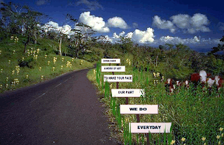
The first thing that I thought of was highway signage and advertising. Berma-Shave and their ingenious solution to make road passengers read and retain information while driving at high speeds. They have split up their billboard ads into several signs that were strategically placed apart from each other to achieve maximum retention in small increments.
I and most of you have also seen the parking garage (photo below) of the skewed and distorted typography that has been painted to make the readability function at the correct angle for a more practical application.
So, even though I have a certain passion for hand-rendered type and its aesthetic properties, along with its monetary economic pros; I am now curiously engaged in the environment and how perspective, angle, placement, speed, light, time, and increment can improve the practicality, legibility, and retention within its specific context and application.


No comments:
Post a Comment