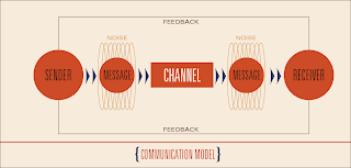
Here is what I came to for my booklet since my Monday crit and feed back. I thought of this booklet in terms as a guide book or field manual for communication, so I decided to aesthetically position it around a government issued look, that doesn't over do it and seem like a gimmick. The structure shows the number of where you are within the communication model and act as a step-by-step process. I believe the hierarchy is correct or getting closer, and I am currently designing the icons that act as indicators or mascots, for each component, throughout. My book is much larger and floppier (10.5" x 5"). I believe I am making great progress and finally have a set direction.


I like the idea of the field manual. so what's the name of it?
ReplyDeleteIs this a 3 or 4 column grid? be consistent with the grid (column and gutter placement) - but also flexible.
the noise visualization is quite elegant here. The model as a whole is really resolved. can it fold out big?
have you dropped the postcard conversation and analysis? while all of this is explaining communication theory, it is missing your point of view.