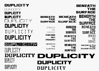
Duplicity was a long process for Lance and I. We have worked on our logotype and identity up until the last 2-3 weeks, that is when we started to actually apply them to significant artifacts that reflected the ideologies of the term Duplicity. The struggle of creating an air tight identity that embodies both of our type experiments was quite a challenge. We have explored ever angle to our conference theme of multiple messages within a singular form, while trying to seamlessly combine the 2D and 3D. As you can see below at our identity logo comps, we have played with different perspectives of layering opaquely, transparently, vertical & horizontal layering, masking multiple depths of patterns and type, utilizing typographic icons, graphic icons, flat and spacious volume/perspective, etc. Lance and I experimented with every visual and metaphorical angle on how to communicate multiplicity. Our process to get to where we are now was a fun, but long journey, it turned into more of an experimental process than our first project.
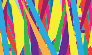
Creating our graphics standards was a little clearer and easier once we had our custom typeface that is an amalgamating compromise between lances 2D ambigrams, and the false perspective of depth from my 3D experiments. Studying the designer Alvin Lustig, Lance and I have created graphic elements and patterns that reflect his process of extracting specific parts of letter forms and utilizing them as a graphic component. Lance and I still wanted to create a presence of our original designs separately, so we have our own specific styles present within our artifact patterns. We wanted to structure the sequence of our artifacts from lances patterns to my patterns through the conference time line. Our invitation starts with lances ambigram graphics, and slowly fuses and changes into my transparent depth patterns in the iphone app and all the way down to the name tags.
Our artifacts were carefully chosen and designer to have the dual purpose or function of the Duplicitous nature. The Invitation is a six paneled french fold poster that acts as a persuasive advertisement, an informational source, and a poetic experience of just a pretty poster. This two sided poster has a perforated panel, which is a business reply to receive more information and registration.
The iphone app which attendees may download before the conference, expresses the dual structure of our conference which is split up into 2 major sections; the beauty of 2D ambigrams, etc and the 3D realm of environmental signage. The dual function here is the ability to search by specific sessions, a day by day calendar, and a micro & macro view of event details; which includes lectures, workshops, and optional time.
To complete the continuity of repeating the philosophy of Duplicity, we chose the Nelson Atkins Museum of Art for its separation of the old and new architecture, multiple literal levels and stories, realty of gallery space to present work, ampitheater for lectures and presentations, parking space, outdoor lawn space, and classrooms for workshops.
So alas, after typing and struggling with proper grammar throughout this post (excuse the grammar hiccups), we finally arrive at the visual working process of how we got to our final Duplicity identity system!
Visual Process: For now here are some identity process work, since that's the majority of where our time went on this project. Lance has posted all of our artifact process, while I have posted our Identity work for Duplicity.
Identity Work:
Condensed Timeline of Developement until we got to our final!
Patterns & Graphic elements for Identity:


No comments:
Post a Comment